21.3.1 视图容器
视图容器分为3种:view(普通视图容器)、scroll-view(滚动视图容器)、swiper(滑块视图容器)。
view容器的伸缩方向分为行和列。其相应的代码如下。
<view>
    <view>flex-direction: row</view>
    <view >
        <view>1</view>
        <view>2</view>
        <view>3</view>
    </view>
</view>
<view>
    <view>flex-direction: column</view>
    <view >
        <view>1</view>
        <view>2</view>
        <view>3</view>
    </view>
</view>
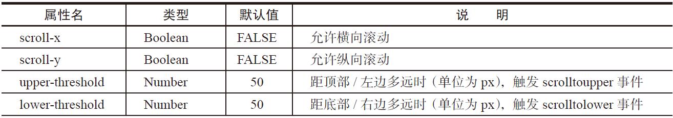
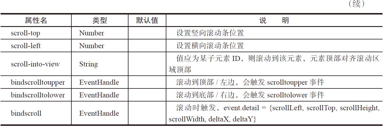
scroll-view可配置的属性如表21-9所示。
表21-9 scroll-view属性说明
scroll-view的示例代码如下。
<view>
    <view>vertical scroll</view>
    <scroll-view scroll-y="true"  bindscrolltoupper="upper"
    bindscrolltolower="lower" bindscroll="scroll" scroll-into-view="{{toView}}" scroll-
    top="{{scrollTop}}">
        <view></view>
        <view ></view>
        <view></view>
        <view></view>
    </scroll-view>

    <view>
        <button size="mini" bindtap="tap">click me to scroll into view </button>
        <button size="mini" bindtap="tapMove">click me to scroll</button>
    </view>
</view>
<view>
    <view>horizontal scroll</view>
    <scroll-view scroll-x="true" >
        <view></view>
        <view ></view>
        <view></view>
        <view></view>
    </scroll-view>
</view>
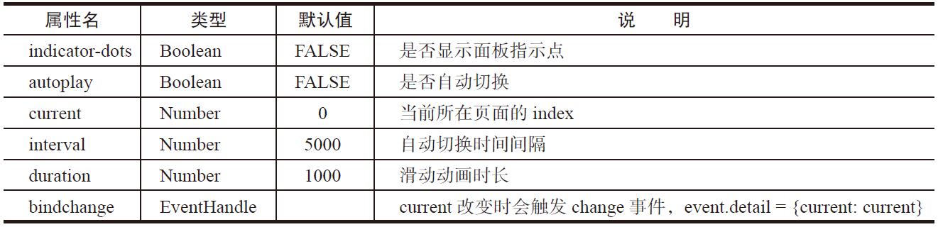
swiper的属性如表21-10所示。
表21-10 swiper属性说明
swiper的示例代码如下。
<swiper indicator-dots="{{indicatorDots}}"
    autoplay="{{autoplay}}" interval="{{interval}}" duration="{{duration}}">
    <block wx:for="{{imgUrls}}">
        <swiper-item>
            <image src="{{item}}"  />
        </swiper-item>
    </block>
</swiper>
<button bindtap="changeIndicatorDots"> indicator-dots </button>
<button bindtap="changeAutoplay"> autoplay </button>
<slider bindchange="intervalChange" show-value min="500" max="2000"/> interval
<slider bindchange="durationChange" show-value min="1000" max="10000"/> duration